Thursday, 21 April 2011

Evaluation

Blog address: http://marthaleeb.blogspot.com/

Website: http://marthaleebirks.carbonmade.com/

Overall I am really happy with my work for this assignment, I feel that my final images are really strong and that I had developed my ideas significantly throughout this project.

I love the aesthetic of my final images, they are just what I was aiming for. All of my research has successfully contributed to my final outcome, I feel that one of my strengths in this assignment has been my attention to detail. In particular my test shoot really helped make my final outcome successful as it made me realise all of the things I needed to do, or not to do in order to make my final shoot a success. In my test shoot I figured out the lighting so that I could recreate the set up in my final shoot, I also realised that I needed to work with a makeup artist and hairdresser.

I am really happy with the model I chose for this shoot she is really confident in front of the camera and is really good at taking direction. I also think that her look works really well with my theme particularly her smile, which is quite a crucial element for this shoot in particular. Looking back on my final images I am really happy that I used her for this shoot.

The pose was crucial for this shoot as they are studio portraits, the focus is entirely on the model. When researching poses there was a limited number to choose from but I think my model did them really well. On the other hand it might have been better to have more of a variety, although I feel that it does show how through the years pose has stayed the same. With the poses being so similar I had to make sure that they were perfect, for example in some of the initial images the smile just isn’t enough or the arms look awkward. However I think that I gave the model relatively good direction and in the end she got the poses spot on.

Getting a make up artist has really impacted on my final images, they look much more professional and suit the theme better than when I did the makeup myself. The makeup artist was really professional and worked well to the brief, she paid attention when I was talking to her about what I wanted and made sure that the makeup suited the theme. The makeup was exactly what I wanted and looks great on the photographs. She created two slightly different looks to suit the colour scheme of the dresses, for the pink and lilac dress she used very pink makeup whereas for the coral dress she used more coral colours rather than the bright pink.

The hair also works much better in these images than in my test shoot, it is in a common beauty queen style and much bigger than in the original shoot. However if I had been able to afford it I would have got a hair stylist to do the hair as they would possibly have been able to get it to look more over the top and bigger.

Originally I was quite worried about the backgrounds, I used several pieces of different pastel coloured card and some pastel textured wallpaper. However I think that they work really well, the colours really add to the images and compliment the dresses and makeup. The magnolia coloured card didn’t work as well on all of the images as the other colours.

I wanted to edit my images quite significantly for this assignment as I wanted the model to look false and almost plastic. At first I wanted to really over edit the images and make her face completely air brushed, on the other hand I really liked the aesthetic of the original images and didn’t want to edit them too much. I decided to edit any really noticeable blemishes and fine lines. In particular I removed laughter lines under her eyes, this made her look quite odd because they are lines that should be there. I really like this idea of her looking not quite right in a similar way to Loretta Lux although not quite as extreme. I also adjusted the levels and curves to improve the images. Later on I then decided to edit the images quite dramatically to make the model look quite plastic and blemish free, I really like the effect the editing created and I am glad I decided to edit them this way.

I am pleased with my final prints, I got them printed using a 12 ink printer so the colours were accurate, and I had a glossy finish which I am pleased with.

I wanted my website to be quite simple and easy to use so that and visitors wont get confused or overwhelmed. I decided to use Carbonmade.com to create my website as its easy to use and I really like the layout. I am happy with my final website its easy to use and not cluttered.

Although I am really happy with my final images if I would have had time to do another shoot I would perhaps have made sure more of the dresses was seen by doing longer shots, which was difficult to do using the card backgrounds. Despite some of the problems with getting equipment my final shoot went well and I am really happy with my images for this assignment.

Website

I used carbonmade.com to produce my website, its simple and easy to use.


These are screen shots from my website. Its very basic and uncluttered and i feel it works well.


Final images


I am really happy with my final images, have decided to order them in this way so that it breaks up the poses as the 1st and 3rd are similar. I also wanted to have the magnolia background in between the other two. I feel that these images reflect my research and work well within my theme/idea.

Tuesday, 19 April 2011

Editing the images

I wanted to manipulate my images quite significantly to create this sense of the model being plastic and quite fake. I removed all major blemishes from her skin including any spots, fine lines or skin blemishes.

After

Before


In this image along with many of the other's there are creases under the eyes because she is smiling, I decided to use photo shop to remove these line. This makes the face look almost quite odd and unnatural because these lines should appear when smiling. This gives the odd appearance I was trying to create in my images.

I also adjusted the levels and curves in photo shop to improve the appearance of my images.

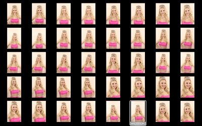
CONTACT SHEET Lilac Flower dress

These are the contact sheets from my final shoot with the lilac flower dress, I really like the lilac coloured background and think there are a few of these images that work really well.


CONTACT SHEET Bright Pink Dress

These are the contact sheets from the shoot with the Bright pink dress, again I think I could have some really successful images in this dress. I used the magnolia with this background as i felt it would work best.


CONTACT SHEET Coral Dress

These are the contact sheets from the shoot using the coral dress, I shot on both the pink and the magnolia background. I am not as keen on the magnolia coloured background as i am the pink wall paper, on the other hand some of the images on the magnolia background work really well. I think that I have some successful images for this dress.


Monday, 18 April 2011

Before the sync lead...


As I mentioned earlier I was unable to get any device to trigger/sync the lights from stores even though I had booked radio triggers, these are some test shots when I was trying to use the flash gun to trigger the lights. As you can see they are awful! The lighting was either flat, too much or the lights didnt trigger at all.

Sunday, 17 April 2011

Hair

I think the hair has improved dramatically compared to my first shoot. I went around to several hair dressers to see how much it would be for them to style the hair for this shoot however the average was around £35-40 even in small salons, and unfortunately I couldnt afford to do this. However I spoke to the make up artist i used and she had some experience doing hair and I also knew Becky was good at hair so between them they styled the hair. I wanted it very big and over the top, i showed them several pictures to use as a source of inspiration.
Becky curled the hair in lots of wringlets, again this is a style seen frequently on beauty queens. The curls also gave the hair volume making it appear bigger.

Callie (MUA) worked the hair to make it big and give it volume, she used backbrushing and created a lifted section (as seen on quite a lot of images i looked at as research).


Make up

The makeup for this shoot was much more successful than the make up in my first shoot, the make up artist was really good and really listened when i was telling her what i wanted. She followed the theme perfectly and created two different looks for the colour schemes of the dresses. The make up was over the top and pristine just as id wanted and the colours were perfect for the theme.


Make up artist: Callie Marie Callighan
http://www.facebook.com/cmcallighanmua

Saturday, 16 April 2011

Problems with stores

Unfortunately I have had a lot of trouble with stores since the change over, iv booked equipment on several occasions and then been told that they have booked it out to someone else. On the day of the shoot I had radio triggers booked out but was unable to take them out as they had given them to someone else. I was then told that i could use a flash gun to trigger the lights, which worked but made my images look awful! After about two hours of this and several trips to stores in the media factory and Darwin I managed to get hold of a sync lead to use.

Dresses - DB3

These are the three dresses that I chose to borrow from DB3, while looking in town and on the internet for dresses i came across these three which i thought would be perfect. They are all very over the top and fit the sugary sweet colour scheme i aimed for. They are the kind of dresses that would appear in beauty contests, they are showy and attention seeking right from the colours to the detail and embellishment. I am really lucky that I was able to borrow these for the shoot as they cost around £300 each and i would have been unable to afford them, so I am very grateful to DB3 and told them I would do some images for them of the model in the dresses.


Saturday, 9 April 2011

Dresses - DB3

I also went and asked DB3 if they would lend the dresses i had seen to me for the day of the shoot. They said that providing they are there on the day of the shoot I can come and pick them up so long as I bring them back to the store before five.

MUA

I got in touch with a make up artist i met at the UCLAN style unwrapped fashion show and asked her if she would be interested in doing the make up for my shoot and she said she would be glad to help so hopefully this will really add to the shoot and make the images work better and portray the theme.


Problem!!

I went to book out the studio for my final shoot and unfortunately only the digital studio was available which only has a black backdrop up at the moment, however i need a purple and a white background for my shoot.

One solution i thought of doing was using pastel coloured card and pastel wallpaper as a background instead, it may also tie in better with the colour scheme for the shoot.